
Full Scope Brand Identity & Retainer
UNDIVIDED
In collaboration with Chuck Mingo and the UNDIVIDED Team

Mission
In 2020 the brand landscape of UNDIVIDED began to shift when and in 2021 re-brand became necessary. UNDIVIDED was in a position to reintroduce themselves and their work to a broader audience and they needed a fresh identity to support their efforts.
OUTCOME
Together we designed verbal and visual identity to bring UNDIVIDED into a new season of their work and designed a new websites to showcase their programs and workshops.
IMPACT
Clear perception of UNDIVIDED, Inc's work and vision. Facilitation of growth and bolstered stakeholder confidence through the new identity, messaging and website. Enhanced engagement and community awareness. Built upon and protected brand equity.
SCOPE
Discovery
Naming
Brand Strategy
Creative Direction
Verbal Identity
Visual Identity
Collateral
Website Design
Brand Guidelines
UNDIVIDED formally began its work in 2016. While the personal stories vary, the thread that ties the organization together is a collective of people who have roots in the Christian church who have been troubled by racial harm and injustice. Together they have crafted two six week programs to take businesses and churches through a facilitated journey that brings people together to learn from each other with honesty, integrity, and vulnerability moving them toward awareness, through agitation, and into action.
We started with listening tours and surveys. Wanting to explore if UNDIVIDED was the right name for this non-profit, I got to work examining the data and developing alternative brand names. After a few rounds and many conversations, we decided that UNDIVIDED is the right name for the organization. This name clearly and succinctly communicates the aims and activities of their work.
Next we moved to brand strategy and crafting a verbal identity. In collaboration with the team we refined vision, mission, and positioning statements developed a new tagline, brand voice, tone, and filled a bank of words to keep their messaging clear and consistent. This set the foundation for the visual identity


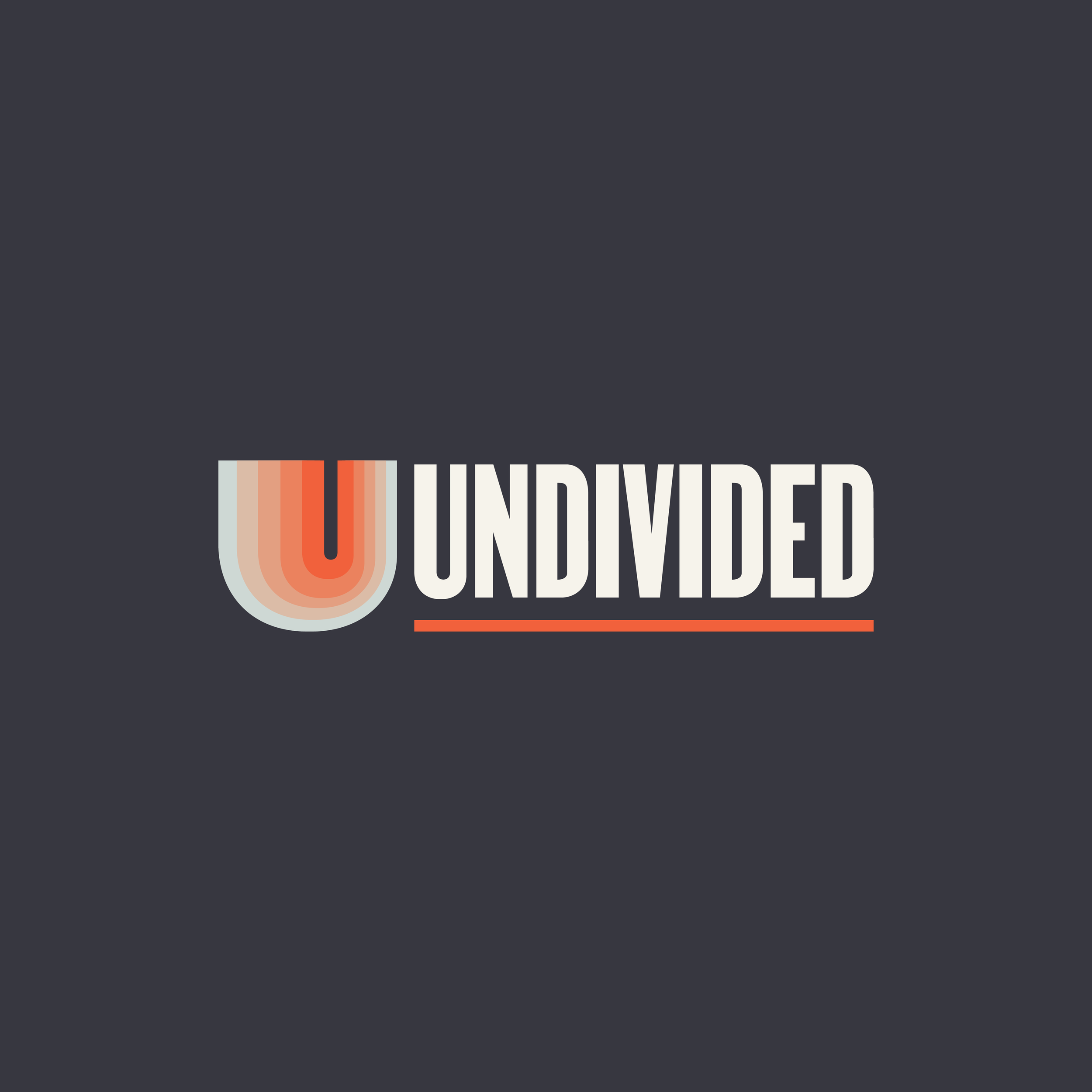
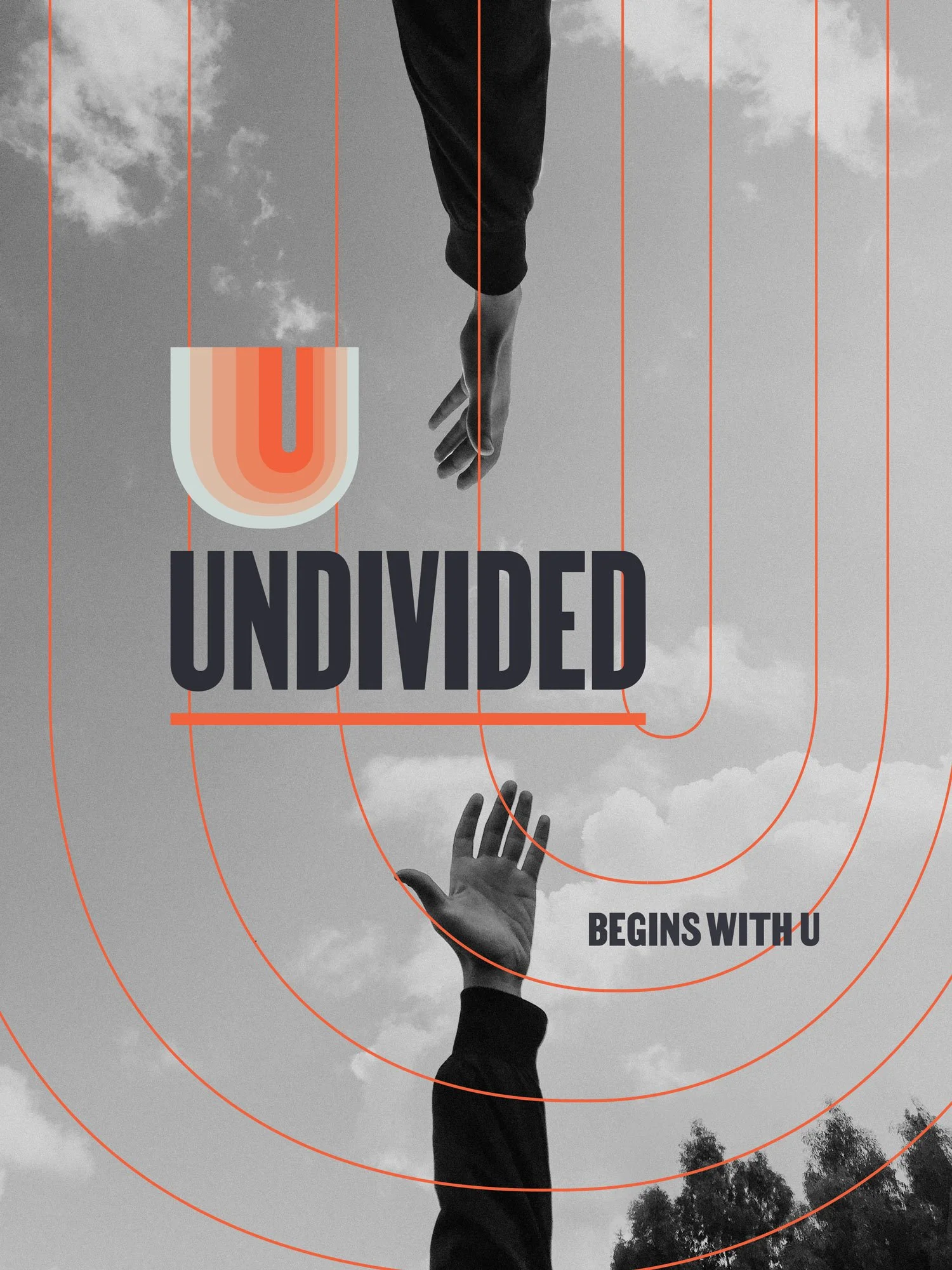
The UNDIVIDED logo is a vibrant invitation to participants to join their stories to each others and become a movement.
The U mark is a joyful reverberation and a declaration that being undivided is many parts bound together to make up the whole. It’s a simple and amusing way to communicate how UNDIVIDED begins –with U. The u is deep and wide, big enough for us all to be a part. The opening is not in the center but is moving right, moving forward toward justice.
The color shifts are an inclusive reference to the multi-ethnic vision for UNDIVIDED’s work. The colors are also a device to illustrate the intensity and calm of the expanding flow of racial justice.


The logotype roots the logo as a whole in the history of the Civil right’s movement. The elongated typeface Martin, by Tré Seals of Vocal Type is a “is a non-violent typeface inspired by remnants of the Memphis sanitation strike of 1968.” The orange underline is a token of resolve and activation.
These key decisions are rooted in UNDIVIDED’s core values of courage, joy, and humility.


In addition to the primary brand, each program needed it’s own sub-identity. LivingUNDIVIDED is targeted toward churches and faith-based organizations, while WorkingUNDIVIDED centers businesses and corporations. The goals of both programs is the same, while the approaches to the content differ. This is reflected in each of the sub-branded elements.
We also developed icons to visually communicate UNDIVIDED’s core values and to help identify the themes of the seven week cohort experience.


Finally, we worked together with web Ninja Phil Willson to develop the new website I designed. Take a look at the full site here.
Watch an interview with UNDIVIDED’s marketing manager, Mat Mithaler.