
The Challenge
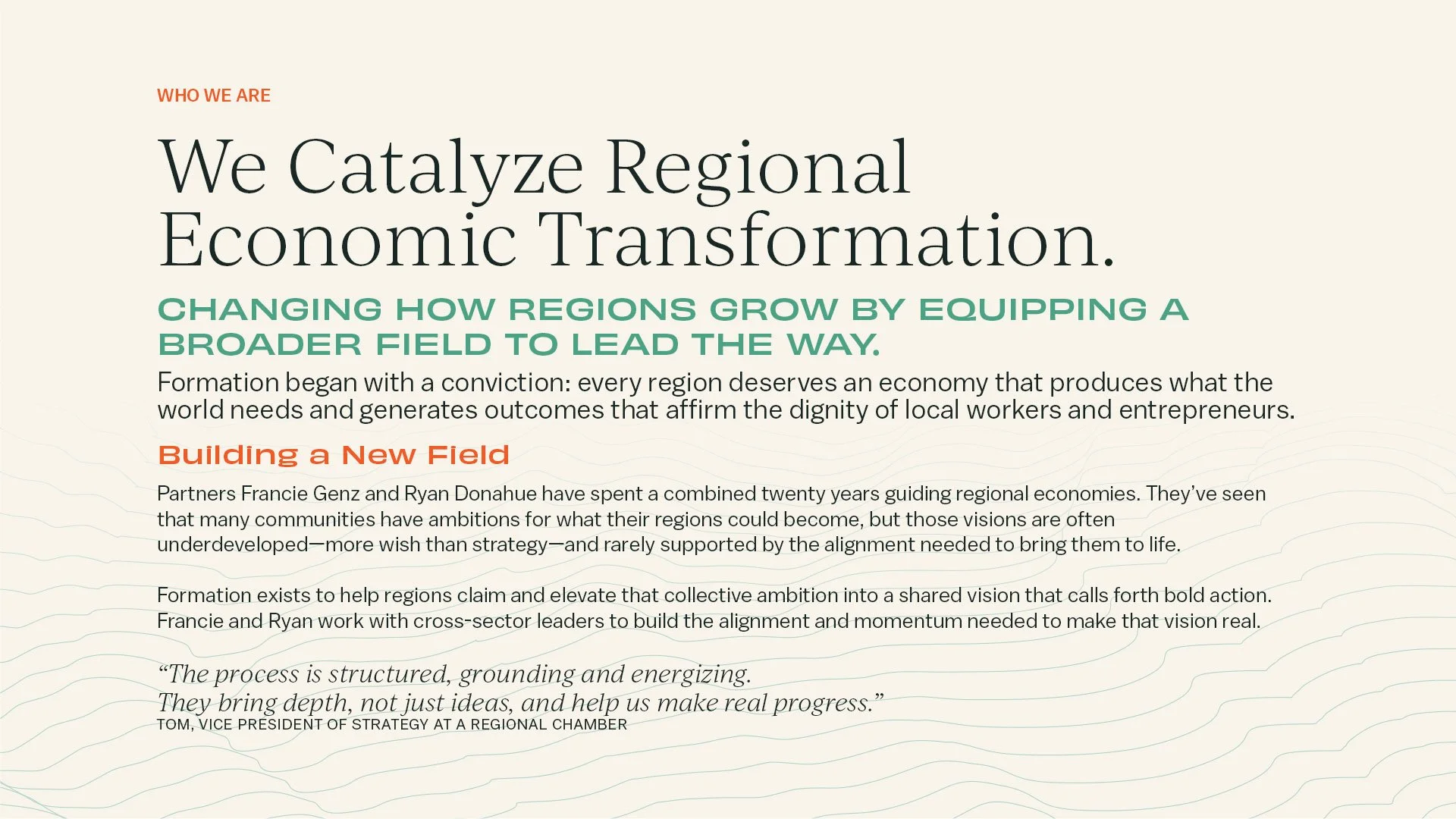
Formation partners with regions, coalitions, and communities to build economies that work for everyone. Founders Francie Genz and Ryan Donahue saw that many regions have ambitious visions for the future but lack the alignment and tools to bring them to life.
They created Formation to turn collective ambition into shared strategy—helping leaders connect insight to action and build the momentum needed for lasting change. The brand needed to reflect this shift: from aspiration to grounded, collaborative movement.

Stacked Primary LockupThe Approach
The engagement began with a deep strategy phase. After receiving multiple source documents from Francie and Ryan, we met for a three-hour strategy session to clarify their goals, audiences, and field context. From there, I researched and synthesized a 35-page brand strategy document articulating Formation’s purpose, mission, vision, traits, values & operating principles, audience insights, positioning, and messaging.
That work revealed the core of Formation’s practice—rigor built on trust, alignment that creates momentum, and transformation grounded in equity and dignity. The visual identity needed to express a balance of strategic precision paired with human depth.
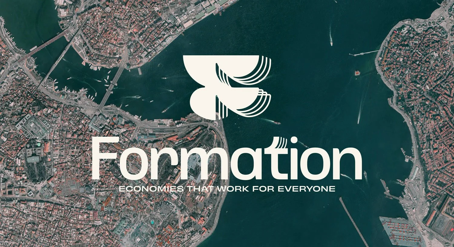
At its center is a custom mark of interlocking arcs and nested curves, evoking both an “F” and a bird in flight. Three metaphors guided the design:
Murmuration: coordinated motion, where individuals move in sync while maintaining their unique rhythm.
Peloton: collective momentum, where shared effort reduces resistance and carries the group farther together.
Geologic Strata: layers of trust built over time, reflecting patience, endurance, and the slow work of systemic change.
The custom wordmark extends these ideas through softened geometry and a distinctive “t” that mirrors the mark’s nested arches—a subtle gesture of alignment and rhythm within a living system.
Icon-only LockupBadge Lock-up
Horizontal Primary Lock-up
Wordmark
Newsletter Lock-up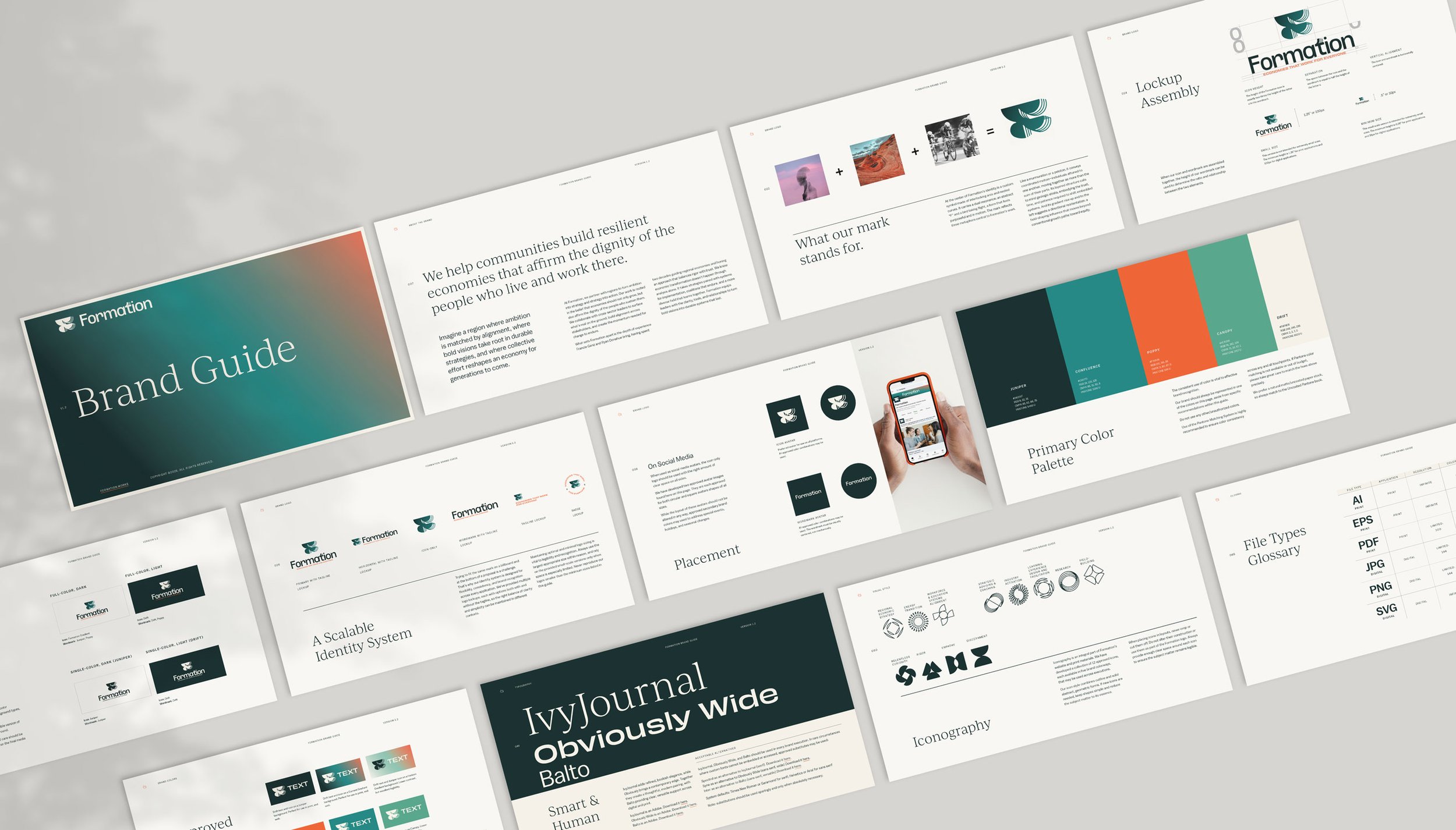
The Solution:
Together, we built a comprehensive identity system and toolkit that brings Formation’s conviction—economies that work for everyone—to life with clarity and precision.
Key Brand Elements:
Visual Language
A system rooted in formation itself: interlocking arcs, layered strata, and directional motion that express trust, alignment, and forward movement. The design mirrors how regions build durable systems—one layer, one relationship at a time.Logo System
A scalable logo family anchored by a softened geometric wordmark and custom symbol—an emblem of motion, trust, and field-shaping vision.Color & Typography
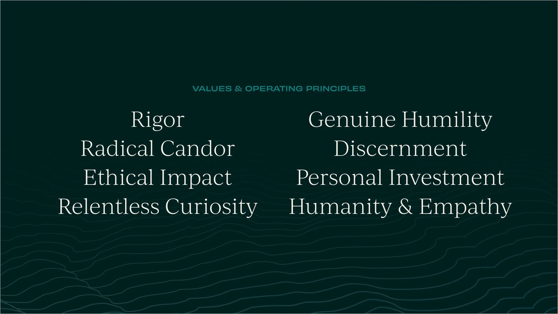
A sophisticated palette—Juniper, Drift, Canopy, Poppy, and Confluence—with two gradients balancing warmth and rigor. The typographic pairing of IvyJournal, Obviously Wide, and Balto conveys both intellectual depth and modern confidence.Iconography & Patterns
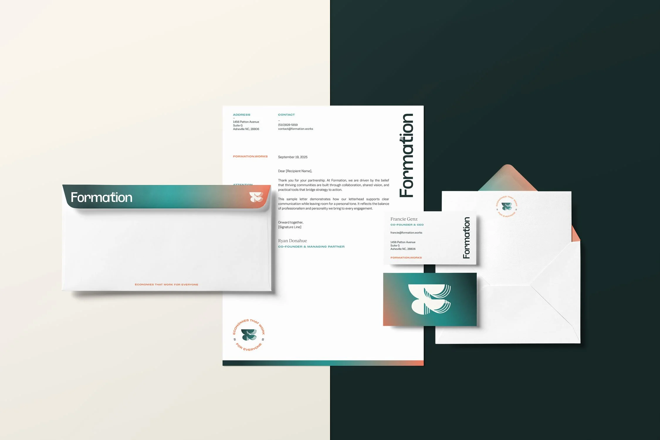
A modular icon suite and strata-based backgrounds extend the system across print and digital formats, reinforcing the brand’s themes of coordination and grounded movement.Collateral System
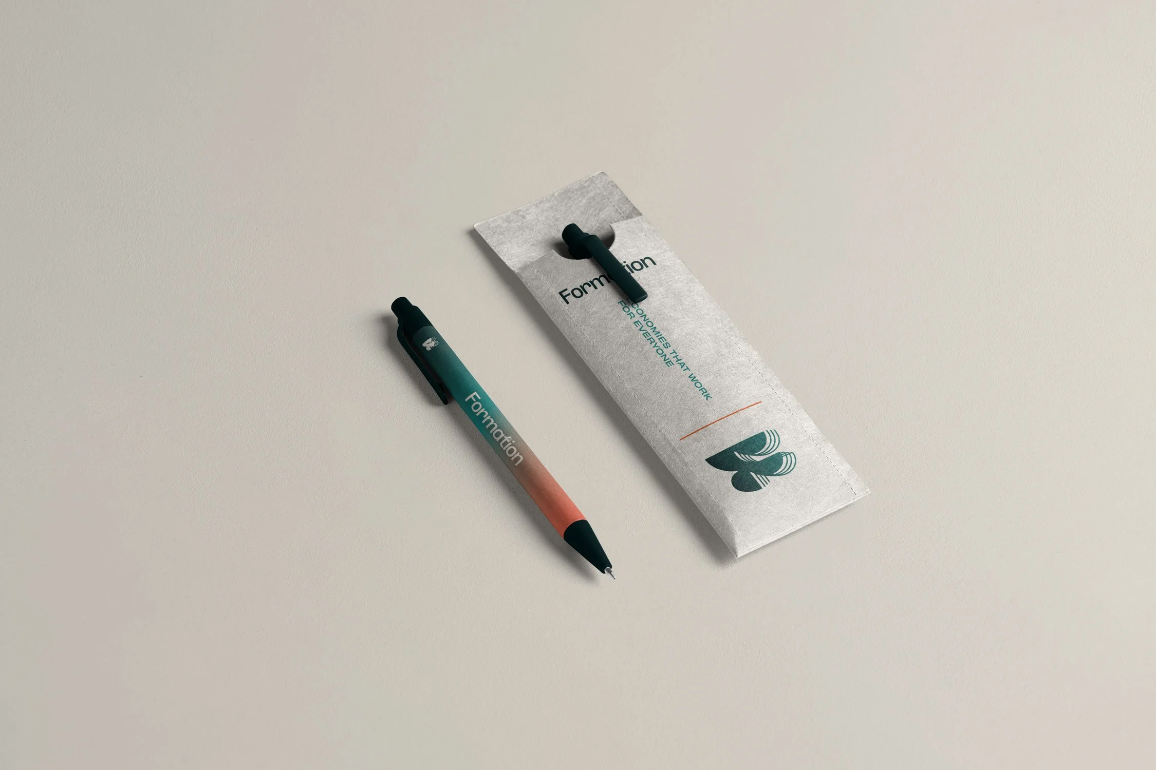
From custom pens to a full stationery suite, the identity takes tangible form. A branded slide deck and Canva kit empower the Formation team to create future materials with consistency and confidence.Brand Guidelines
Comprehensive guide for identity system usage.